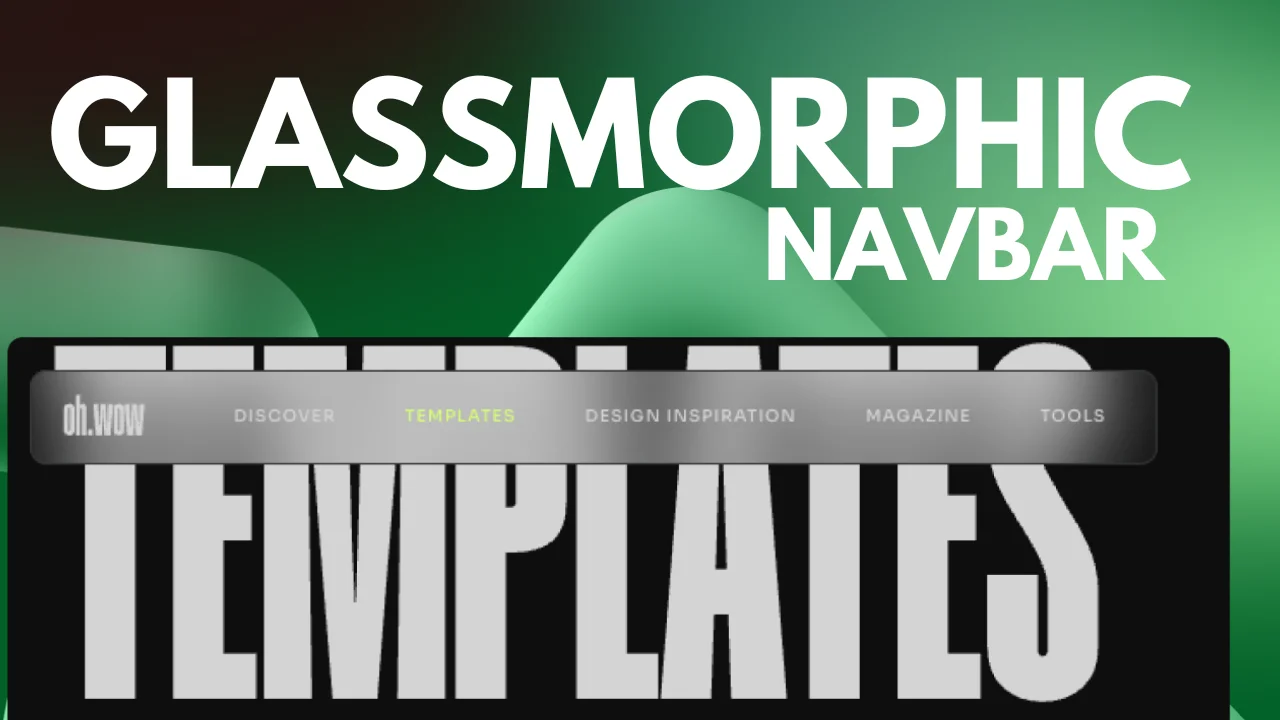
Crafting a Sleek and Modern Navbar: A Step-by-Step Guide
Creating a stylish and functional navbar for your website doesn’t have to be complicated. In fact, with just a few lines of code, you can achieve a sleek design that’s both modern and user-friendly. Let’s dive into the process of building a navbar right here on your webpage.
Building the Navbar (Desktop)
1. Add a container (parent):
This container will hold a child container which in turn will hold:
- Logo
- WordPress Menu
- HTML Widget for the mobile custom burger menu
2. Applying the Frosted Glass Effect:
Go to the Advanced tab in of the parent container and navigate to CSS Class. Set your class name here and don’t forget to add it to your code (.your-class).
To give the navbar a frosted glass effect and a modern drop shadow, use the following code:
.your-class {
    background: rgba( 255, 255, 255, 0.01);
    backdrop-filter: blur( 25px );
    -webkit-backdrop-filter: blur(25px);
/* OPTIONAL - replace the rgba with your own color */
    box-shadow: 0 8px 32px 0 rgba( 31, 38, 135, 0.37);
}
3. Styling the parent container:
Set the layout to:
- Full width
- Width: 655px
- Direction: Row-Horizontal
- Justify content: Space Evenly
- Align Items: Center
- Gaps: 17px
Go to the Advanced tab and set the margin-left to 0.5% & padding top-bottom, 2px.
4. Border Styling:
To add a border to the navbar go to Style:
- Border: Solid
- Border width: 1px
- Border color: #3B3E42
- Border radius: 10px
Adjust the color of the border to a shade that complements your design.
5. Adding Height to the Navbar:
Ensure the navbar has a defined height by setting a 4vh value to the child container & a width of 658px.
Building the Navbar (Mobile)
1. Responsive Design: The navbar should adapt to different screen sizes. Let’s optimize it for mobile:
On tablet view, set the parent container’s width to 98%.
On mobile view, set the parent container’s width to 100% & height to 5vh.
Add this code to the HTML widget to construct a custom-made burger menu:
<!-- HTML burger menu -->

<input type="checkbox" id="nav-control" class="burger-nav_control">
<label for="nav-control" class="burger-button">
    <div class="burger" role='button' tabindex="0"
     aria-label="Menu" aria-controls="navigation">
        <span></span>
        <span></span>
        <span></span>
    </div>
   <!-- remove this line of code if you don't want the word MENU next to the burger icon -->
   <span style="margin-left: .5rem; color: white;">MENU</span>
</label>

<div class="burger-navigation">

  <!-- change the number of the template with your own -->
  [ elementor-template id="2688" ]

</div>CSS
/* code to style the burger menu (add this to the HTML widget) */
.burger-button {
color: #fff;
display: flex;
height: 28px;
cursor: pointer;
position: relative;
z-index: 9999;
}
/* (change the number of the template with your own)*/
.elementor-2688 {
width: 100%;
animation: fadeInRight 1s ease-in-out;
}
.burger-navigation {
position: fixed;
top: 0;
left: 0;
transform: translateX(100%);
overflow: hidden;
transition: all 0.5s ease-out;
width: 100%;
height: 100vh;
z-index: 100;
}
.burger-navigation {
display: flex;
justify-content: center;
align-items: center;
transition: all 0.5s ease-out;
}
.burger-button .burger {
position: relative;
}
.burger-button .burger span{
display: block;
height: 2px;
width: 34px;
background: #fff;
transform-origin: 50% 50%;
transition: all 0.1s 0.2s ease, transform 0.2s ease;
}
.burger-button .burger span:nth-child(2) {
transform: translate(0, 6px);
}
.burger-button .burger span:nth-child(3) {
transform: translate(0, 12px);
}
.burger-nav_control {
position: absolute;
left: -9999px;
width: 100%;
clip: rect(0, 0, 0, 0);
}
.burger-nav_control:checked~.burger-navigation {
transform: translateX(0);
opacity: 1;
transition: transform 0.3s, opacity 0.3s;
}
.burger-nav_control:checked~.burger-button .burger {
transition: all 0.1s 0s ease;
}
.burger-nav_control:checked~.burger-button .burger span {
background: #fff;
transition: all 0.1s ease, transform 0.1s 0.2s ease;
}
.burger-nav_control:checked~.burger-button .burger span:first-child {
opacity: 0;
}
.burger-nav_control:checked~.burger-button .burger span:nth-child(2) {
transform: translate(0, 6px) rotate(45deg);
}
.burger-nav_control:checked~.burger-button .burger span:nth-child(3) {
transform: translate(0, 4px) rotate(-45deg);
}
@keyframes fadeInRight {
from {
opacity: 0;
transform: translateX(300px);
}
to {
opacity: 1;
}
}Conclusion:
Building a sleek and modern navbar is achievable with just a few lines of code. Whether you are designing for desktop or mobile, these steps will guide you through creating a navbar that is both functional and visually appealing.
Let’s take a moment to appreciate our handiwork. Voila! Your website now boasts a modern, user-friendly navbar that enhances the overall user experience. Whether you’re a coding novice or an experienced developer, this step-by-step guide will help you craft a navbar that elevates your website’s design and functionality.
