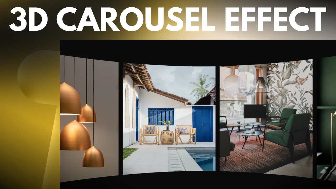
Sometimes the easiest things have the biggest impact
Step 1: Setting Up the Containers
Start by adding two containers – one at the top and another at the bottom. This is a quick way to add some spacing and visual separation. I’ve set both containers to 50vh.
Step 2: Adding the Image Carousel
Within the middle container, we’ll integrate our image carousel. Here’s how:
- Set the container to full width and adjust the height to 35vh.
- Insert your preferred image carousel. It’s worth noting that for a cohesive look, the images should ideally have the same height.
- I’ve chosen about six images, ensuring they’re of consistent height for a seamless display.
- Customize the carousel settings as follows:
- Slides to show: 3
- Slides to scroll: 4
- Disable arrows and dots for navigation
The above steps depend on how you would like for this carousel to appear. You should customize it however you want.
Step 3: Customizing the Carousel
Navigate to the ‘Additional Options’ to tweak the settings further:
- Disable autoplay
- Enable Infinite Loop
Note: Some elements might be missing in the additional options section, which seems to be a minor glitch. Simply proceed by publishing your changes.
Step 4: Styling the Images
To enhance the visual appeal:
- Go to the ‘Style’ section.
- Add a 25px margin to the images.
- Align the images to the center vertically.
If you notice any image inconsistencies, like varying sizes, remove the mismatched ones to maintain a uniform appearance.
Step 5: Introducing SVG Shapes
Now, let’s add some dynamic elements to our design using SVG shapes. Here’s the breakdown:
- Add an HTML widget to the top container.
- Insert your SVG shape code (see below).
- Adjust the SVG color as needed. The color change is done in a single location in the SVG shape code, making it straightforward.
Step 6: Customizing the SVG Shape Position and Appearance:
- Navigate to the ‘Advanced’ settings of the HTML widget.
- Set the positioning to ‘Absolute’.
- Adjust the horizontal offset to ‘0%’.
- Set the width to ‘Custom’ with a value of ‘100%’. This ensures the shape spans the width of the container.
- To prevent the shape from appearing behind the images, adjust the ‘Index’ to ‘2’.
Duplicate the SVG shape for the bottom container and flip its orientation to the bottom. To create a mirrored effect, you can apply a 180° rotation.
Final Touches: The last step is to match the SVG shape color to the background for a seamless blend. This gives a stunning 3D effect as you interact with the carousel.
Conclusion: This unique design element can be seamlessly integrated into any carousel. As you’ve seen, it adds a captivating 3D effect, enhancing the overall user experience. Whether you’re using an image carousel or a standard one, this design trick is super easy to implement and brings a fresh, dynamic feel to your website!
Code:
<svg version="1.1" id="Layer_1" xmlns="http://www.w3.org/2000/svg" xmlns:xlink="http://www.w3.org/1999/xlink" x="0px" y="0px"
	 viewBox="0 0 804 50.167" enable-background="new 0 0 804 50.167" xml:space="preserve">
     <path fill="#0B0B0B" d="M804,0v16.671c0,0-204.974,33.496-401.995,33.496C204.974,50.167,0,16.671,0,16.671V0H804z"/>
</svg>
